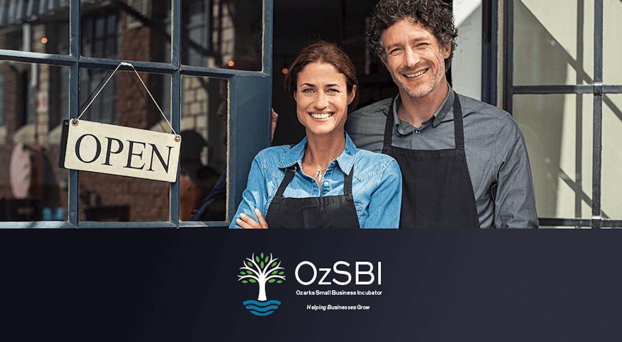
Ozarks Small Business Incubator
We had the pleasure of meeting and working with the fine folks at Ozarks Small Business Incubator to create a fresh new look for their brand.
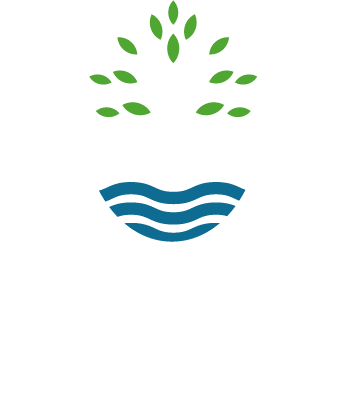
The first order of business was freshening up their existing logo. There were elements that they liked and didn’t necessarily want to discard, so that gave us a bit of a starting point. The image of a tree was very important to the client, with an emphasis not only on growth and prosperity, but also giving focus to strong roots.
Our immediate challenge was to find some kind of mark that could incorporate a cleaner, more modern solution to a tree icon and still have it hold some meaning. After a few vigorous rounds of tree and root sketches, we landed on a stylized and simplified tree mark, and eventually incorporated the waves underneath to add a feel of movement and stability (also symbolizing water/roots/growth).
One of our goals was to also make an overall “egg” shape, but keeping it subtle. A few of the early rounds of sketches had an actual egg shell/shape, but ultimately didn’t have the right feel. Adjusting all of the lines and points to create a visual oval/egg shape proved to be more of a challenge than originally anticipated, but we were happy with the end result.
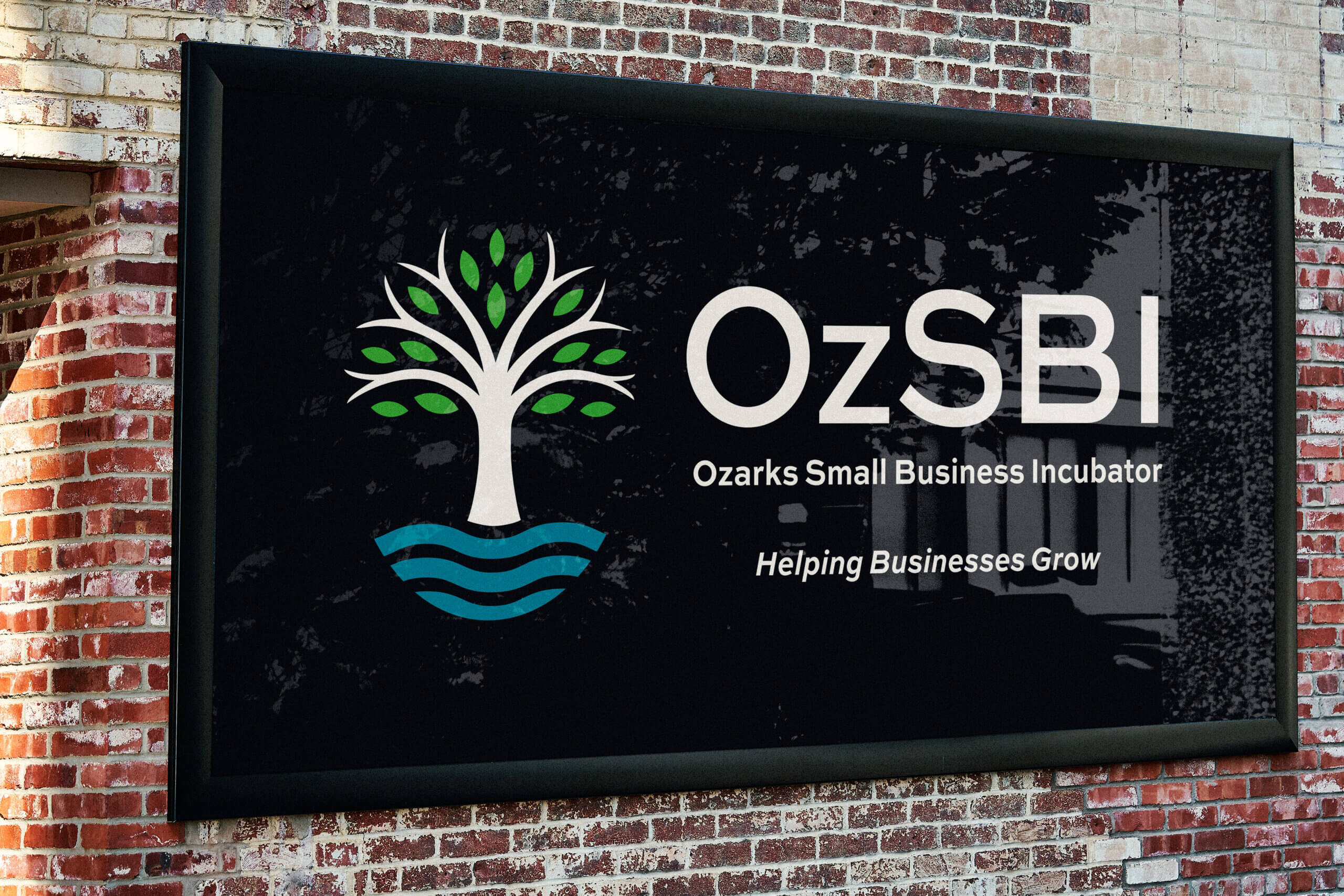
We ended up creating several versions of the logo, as it was a challenge to condense so many words. Additionally, not everyone is familiar with the acronym OzSBI, so we needed to make versions that had the full wording, including their tagline as well. We won’t show you every single version of the logo, but you get the idea. As with all of our logo projects, we made sure to prepare them with every possible scenario and layout.


The color palette did not change a whole lot from their previous version, with the only real changes being in the overall brightness of the blues and greens. We did keep the orange as a very limited highlight color for the website, but found it to be too distracting from the overall feel to include it in the logo.

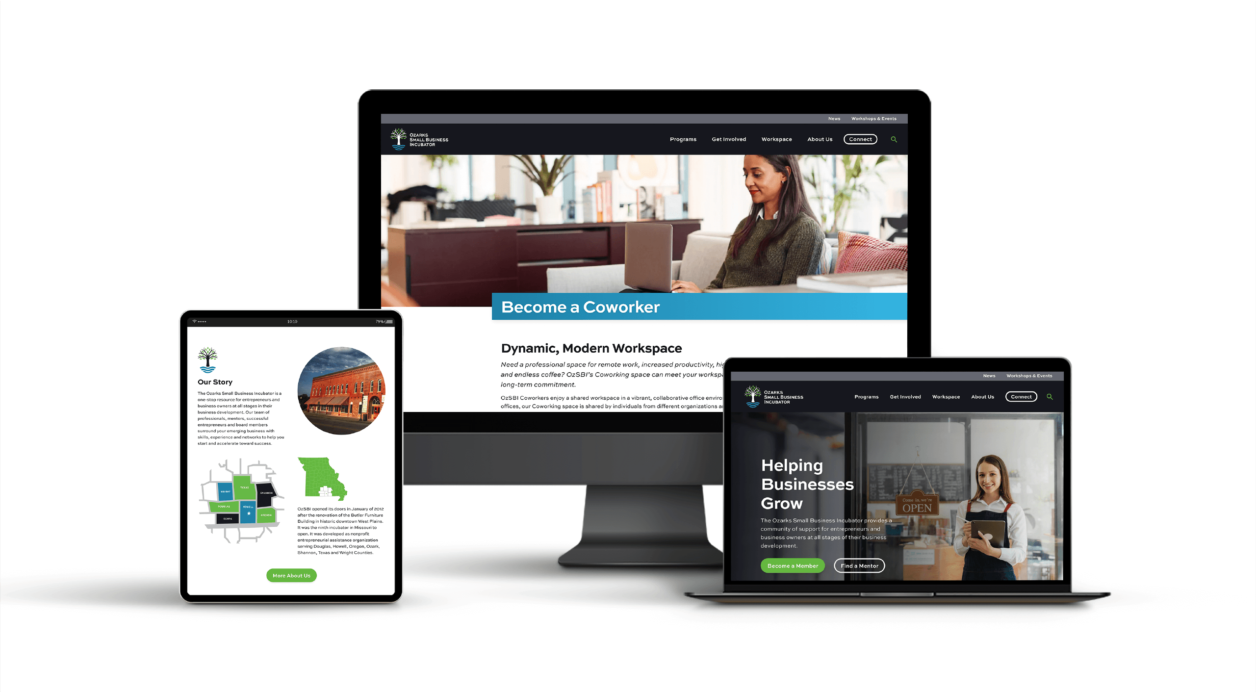
For their website, we wanted to clean things up and add more white space to help with clarity. OzSBI has a lot of information and data on their site, so we wanted to be diligent with breaking that information up into easily consumable chunks for the average user.
We created a few animated sections using background brand colors and a wave separator to help tie in the logo waves. To add additional color pops to the site, we used green duotone icons to help draw focus to the many different features the user is looking for when they come to the site.
You can check out the live site now ozsbi.com.

“We chose Lucent Digital to redesign our website, and we are thrilled with the result.”
—Autumn Shirley


What did our client think?
“After a lengthy RFP and bid process, we chose Lucent Digital to redesign our website, and we are thrilled with the result. Their bid was comprehensive and competitive and we chose them partly because they had worked with clients that had similar needs to ours. We enjoyed working with the entire team, who were professional, friendly, and responsive. Their turnaround time was fast and the whole process went very smoothly. We would highly recommend them.”
—Autumn shirley
Business Development Specialist
Ozarks Small Business Incubator