Wickman's Garden Village
We reimagined the entire brand identity for a local greenhouse. Our goal was to breathe some contemporary life and color into their logo and brand, while still paying homage to their roots (pun intended).
For this conceptual case study, we wanted to see how we could reimagine the entire look and feel of Wickman’s Garden Village, a local greenhouse nestled away on a fairly quiet street here in Springfield, MO. Wickman’s has been around a long, long time, and we love how they are rooted in the community and lean into their family-owned style of business.
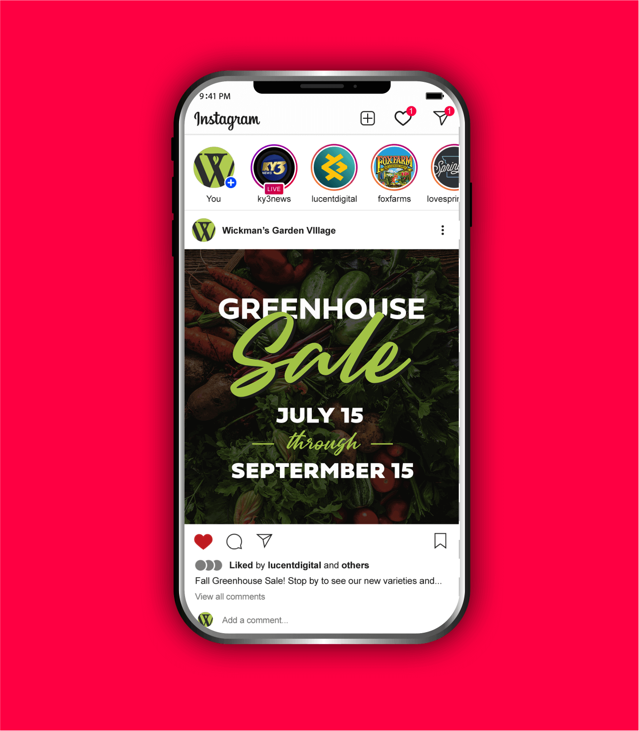
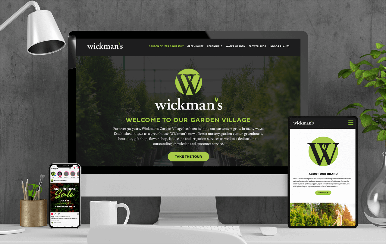
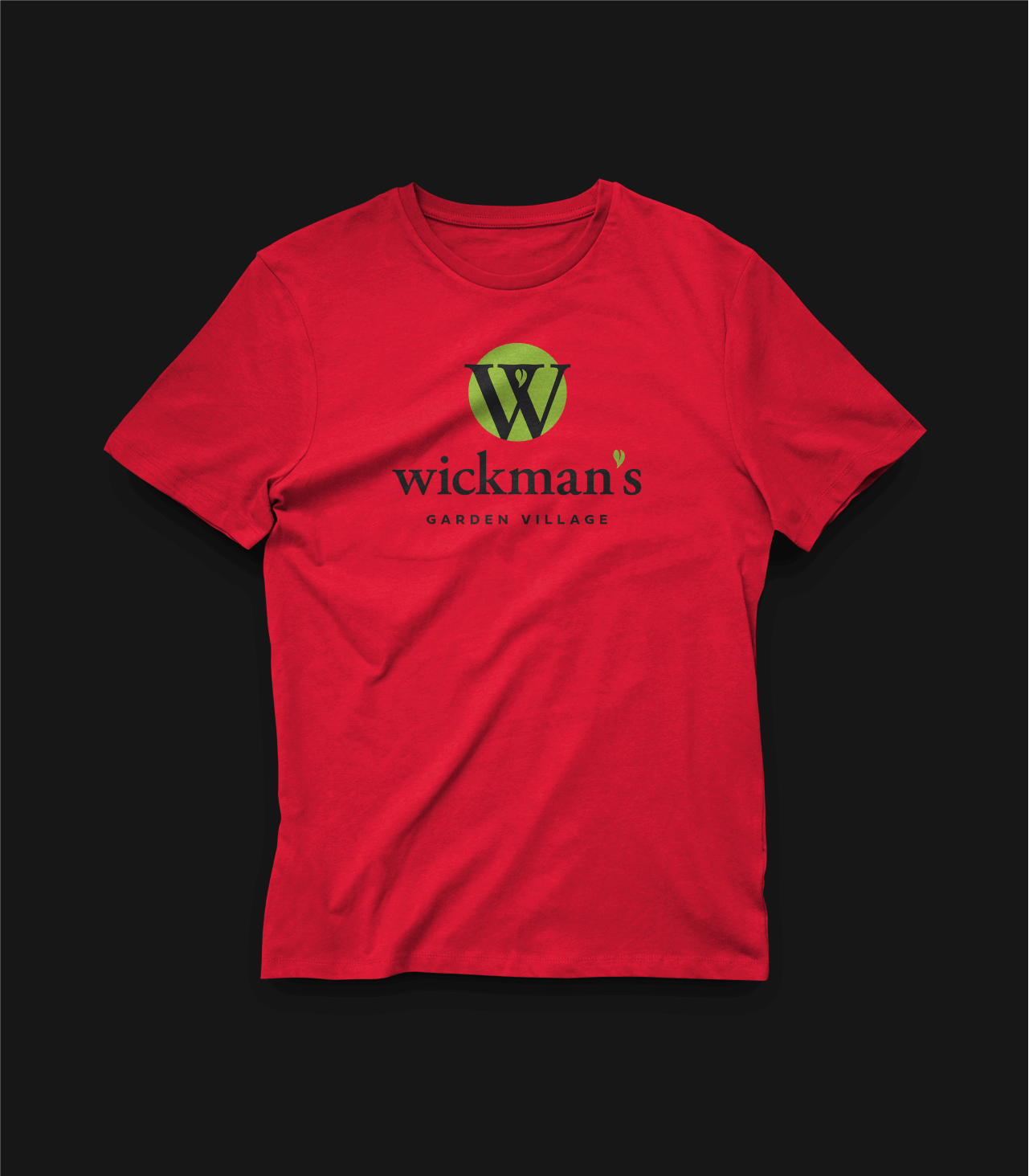
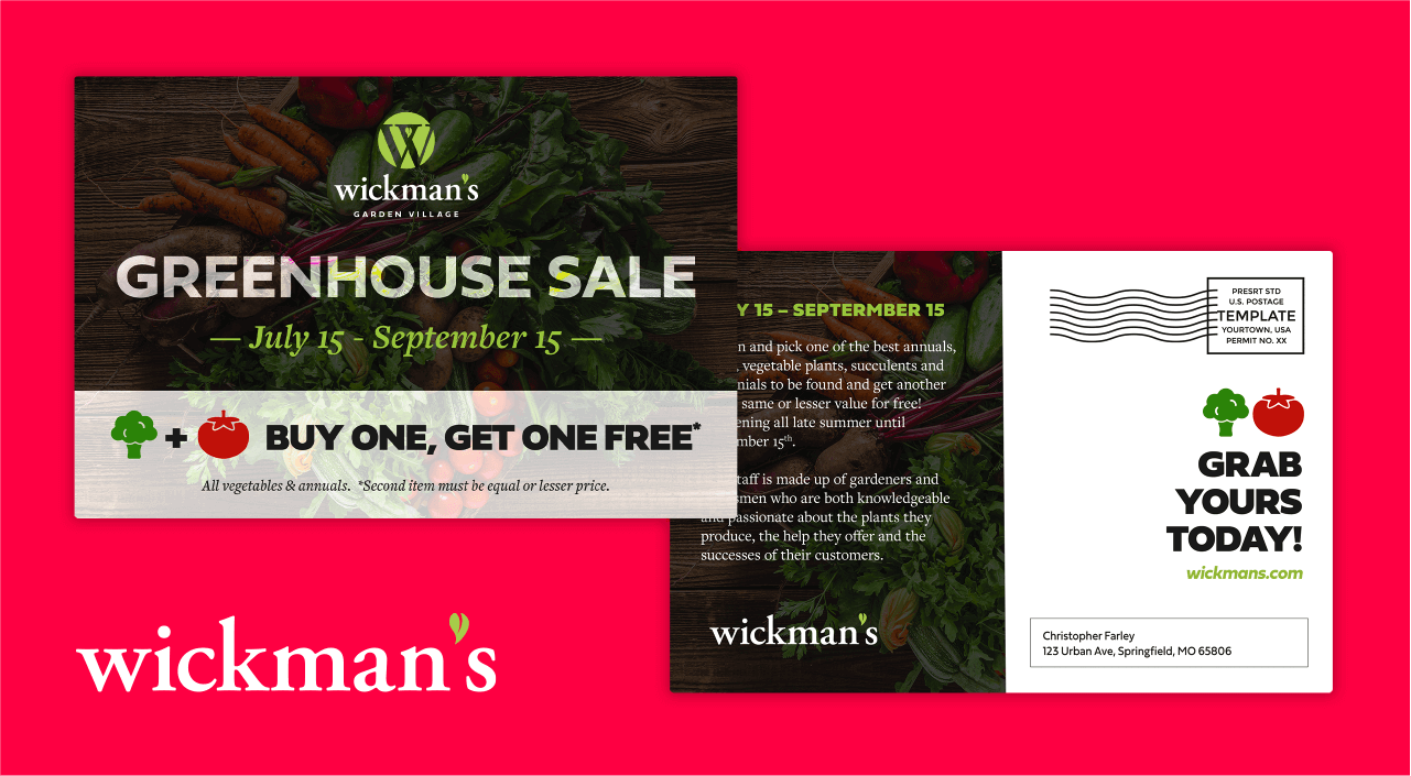
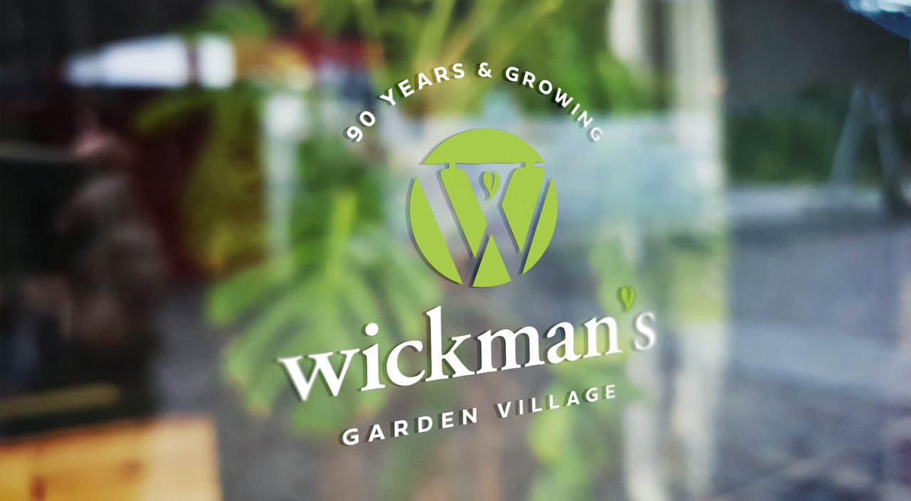
For their logo, we really wanted to clean it up and add some boldness to it, while respecting their original feel. We felt the logo needed to have a brighter and cleaner, more distinguishable look that could easily scale across multiple pieces. It was an easy decision to keep the beautiful serif for the “W”, as it offered a chance to immediately recall the previous Wickman’s logo. A little bit of fun with the negative space created an opportunity to make a single leaf, which also resembles a pepper. Both are appropriate and it ended up being a very simple mark.
It was important to keep the smaller “90 Years & Growing” tagline, as that really does say a lot about their business. But we also wanted to create an opportunity to reduce the logo down into more simple versions, creating a wide scale of uses from tiny web favicons all the way up to signage and staff shirts.

For the color palette, we chose a bright, deep magenta to compliment the vibrant green, which really adds a significant pop of color when necessary. It helps reflect the lush colors you take in when stepping into Wickman’s. A pleasing mix of clean, modern corporate and playful, eye-catching colors allow for a lot of fun to be had for an interior decorator. Just imagine that accent wall! We were also mindful of possible staff shirts and the colors they may need to use, and threw in a polo shirt for those important meetings.
We thoroughly enjoyed this conceptual case study, and are excited to see what else we can create for all of the wonderful local businesses in the Ozarks!